

Share this tool:
Description:
Bricks AI is built for people who work with data but do not want every report to become an Excel project. You bring in spreadsheet-style data, ask for what you need in plain English, and Bricks helps create dashboards, reports, charts, tables, summaries, and org charts. Its best use is not replacing deep business intelligence systems. It is helping everyday teams turn raw data into something clean, visual, and useful much faster.
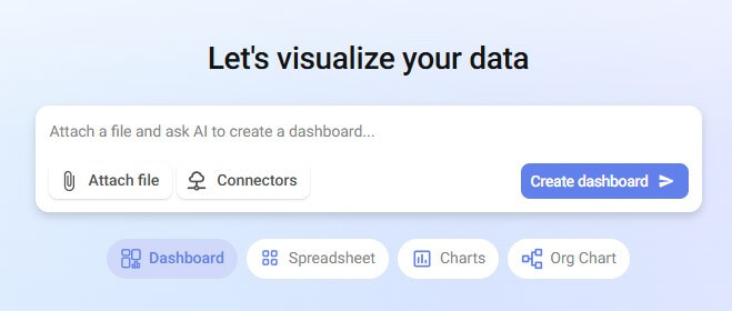
Bricks is an AI data analyst and reporting workspace. The platform says it can turn CSV, Excel, or PDF data into dashboards and reports with charts, KPIs, tables, and written insights. That matters because most teams already have the data. The harder part is cleaning it, deciding what to show, choosing the right visuals, and making the final report readable.
The product sits between a spreadsheet, a dashboard builder, and a lightweight reporting tool. You still get spreadsheet-style work, but the AI layer handles more of the manual setup. Bricks’ AI spreadsheet page says users can describe tasks in plain English instead of writing complex formulas, and the tool can help with calculations, data cleaning, formatting, and analysis.
That makes Bricks most useful for business users who understand the question they want answered but do not want to build every formula, pivot table, and chart from scratch.
Before using this prompt: Upload a file first. Use bricks_dashboard_sales_data.csv.
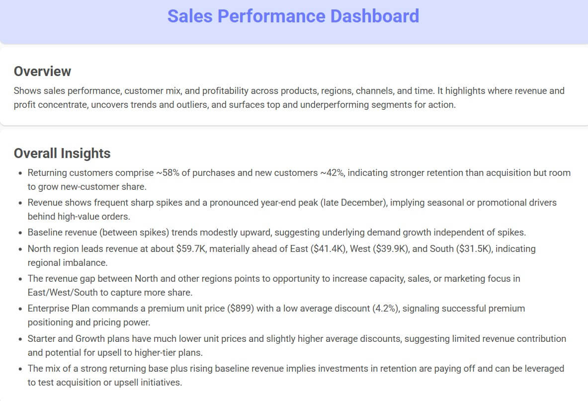
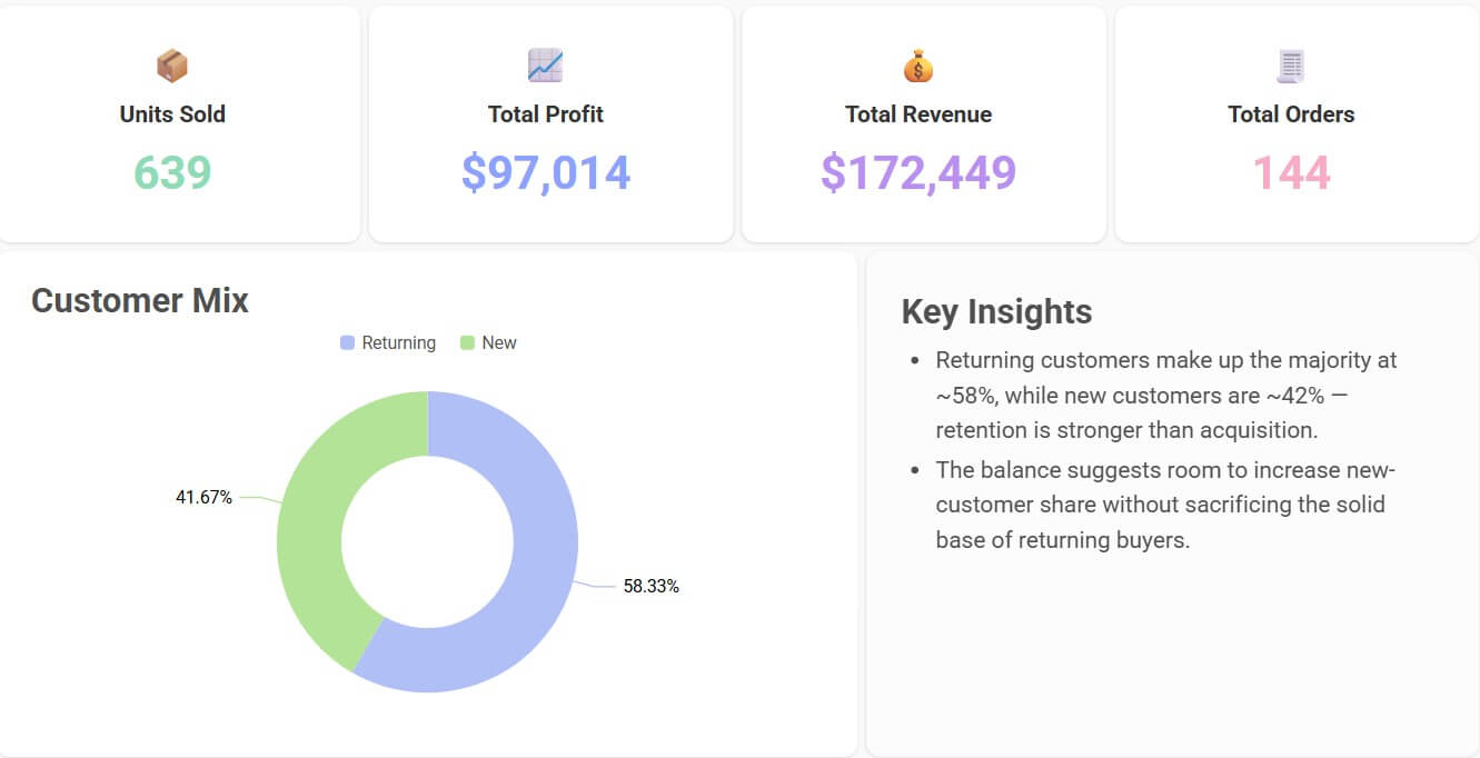
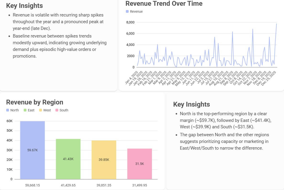
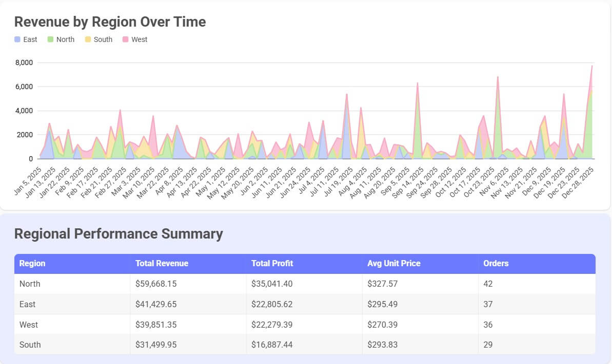
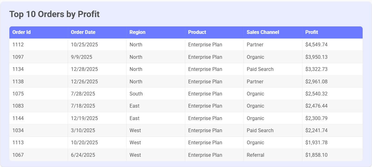
“Create an executive sales dashboard from this spreadsheet. Show total revenue, monthly revenue trend, top five products, regional performance, average order value, and a short written summary of the main insights.”
This is the kind of prompt that fits Bricks well because it asks for a finished reporting view, not just one calculation. Bricks is strongest when it can combine KPIs, visuals, tables, and written analysis into one dashboard.
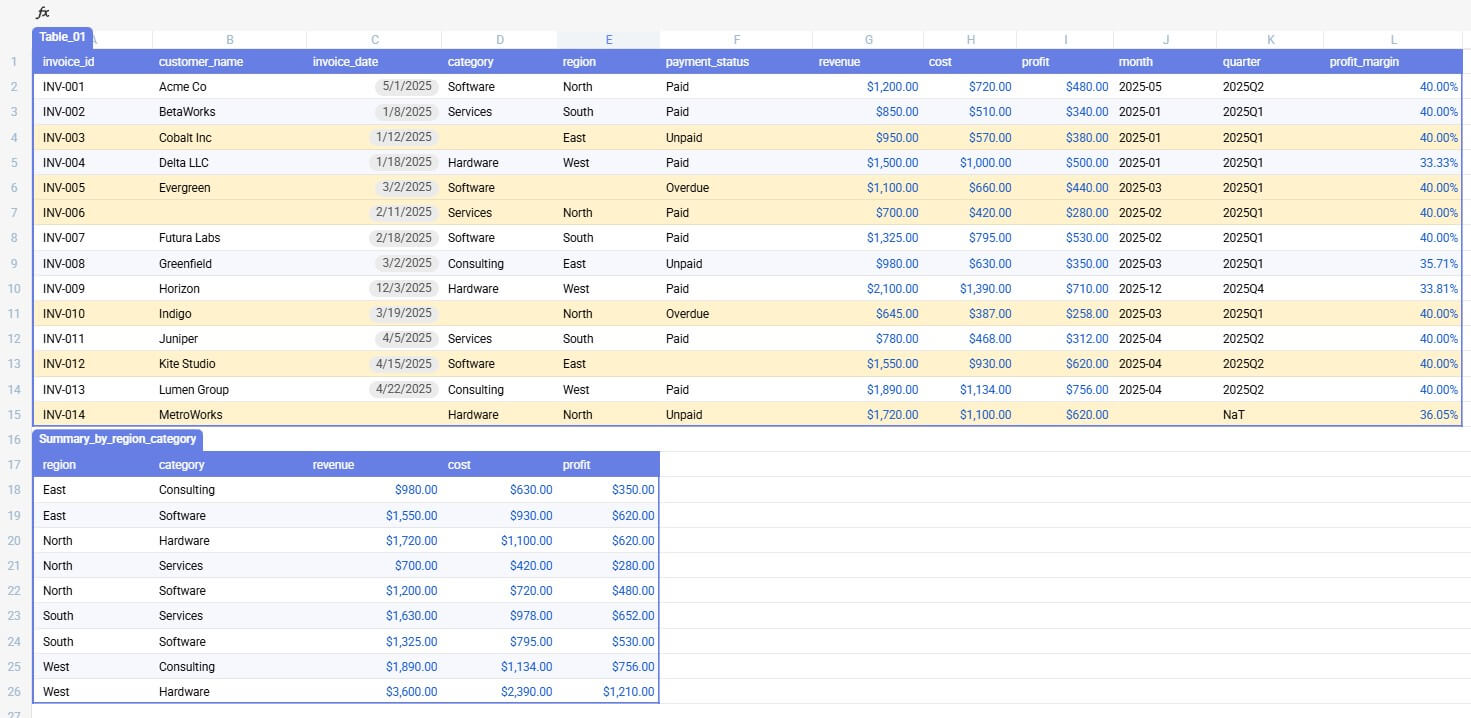
Before using this prompt: Upload a file first. Use bricks_spreadsheet_cleanup_sample.csv.
“Clean this spreadsheet by removing duplicate rows, standardizing date formats, filling missing category names where possible, highlighting blank required fields, and adding calculated columns for month, quarter, and profit margin.”
This prompt is useful before building any report. Clean data leads to cleaner charts. Bricks can help with data prep through natural language, including cleaning duplicates, missing values, formatting, and conditional formatting.
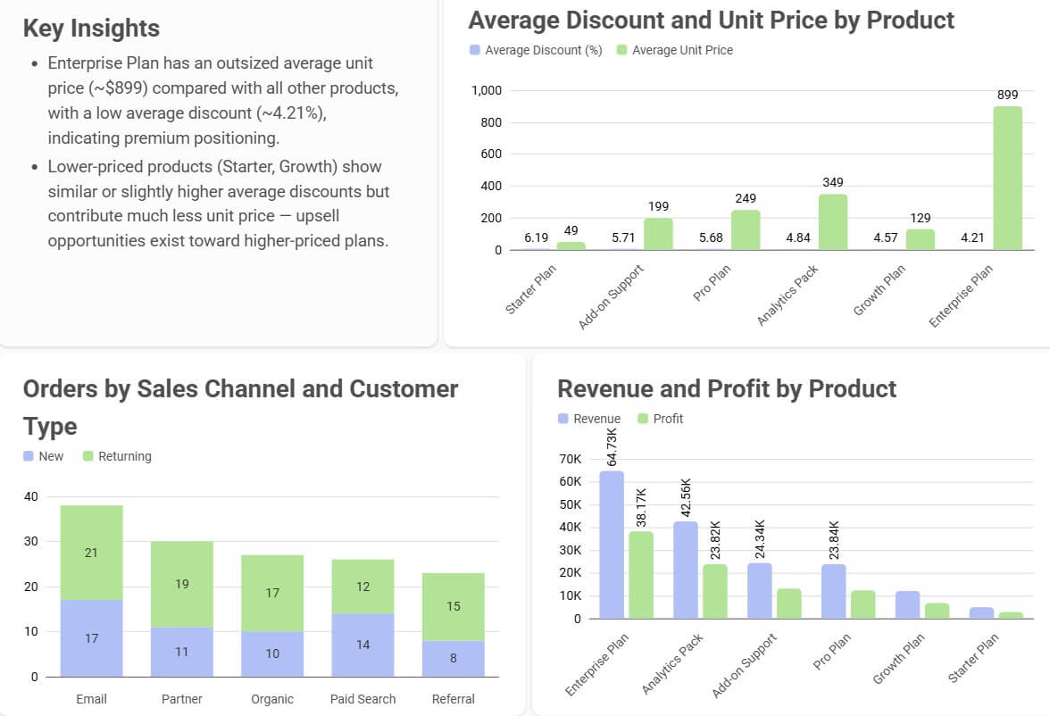
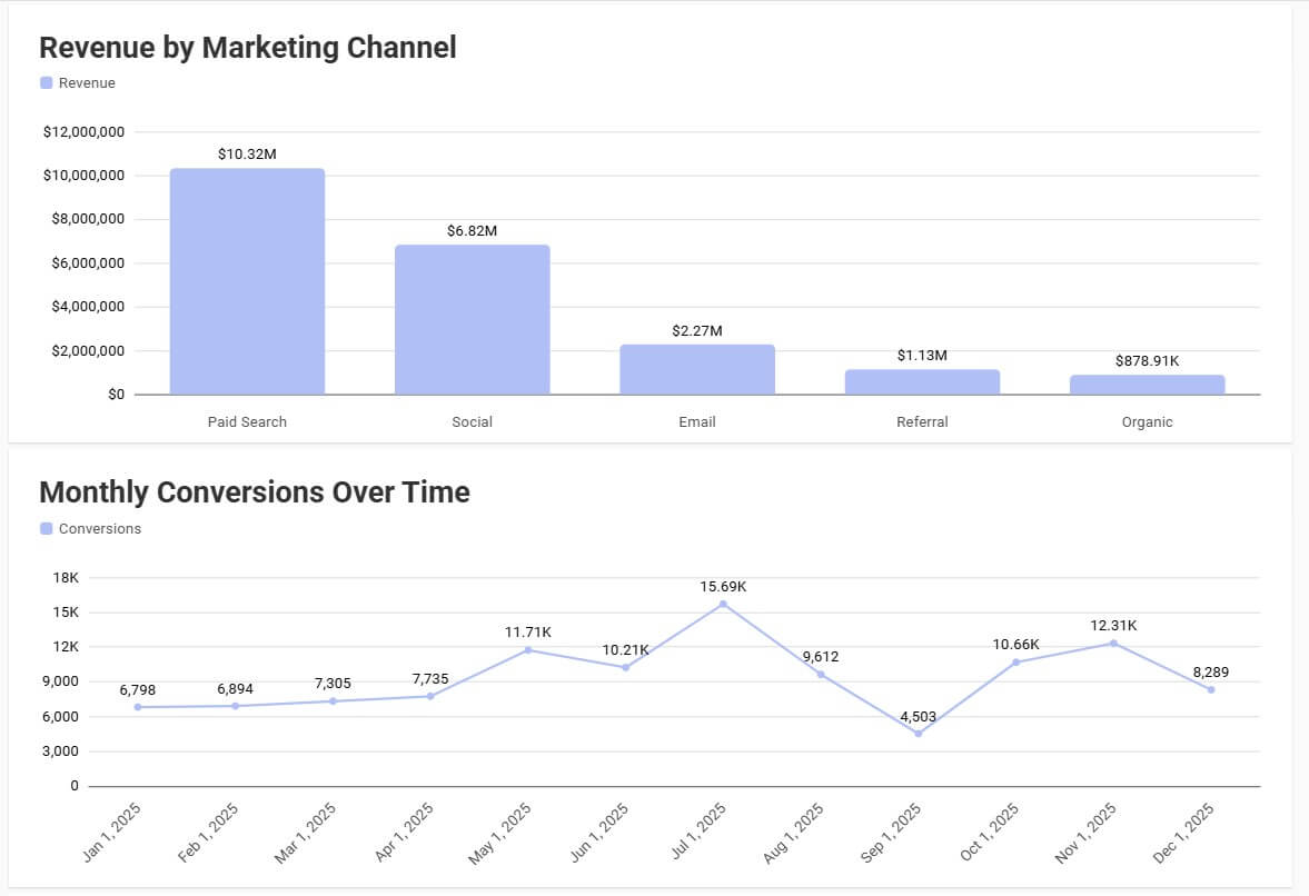
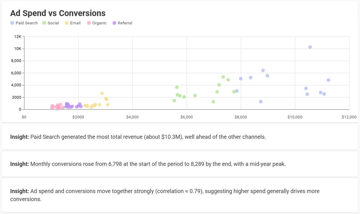
Before using this prompt: Upload a file first. Use bricks_charts_marketing_data.csv.
“Create a bar chart comparing revenue by region, a line chart showing monthly revenue over time, and a scatter plot comparing ad spend to conversions. Add clear chart titles and explain the most important pattern in each chart.”
This works because it gives Bricks both the visual direction and the business question. Bricks’ chart page says it can create bar charts, line graphs, pie charts, scatter plots, tables, KPIs, and more, then let users customize charts with natural language or manual edits.
| Feature | What it does | Why it matters |
|---|---|---|
| AI Dashboard Creation | Creates dashboards from spreadsheet data with charts, KPIs, tables, and insights | Turns raw CSV or spreadsheet data into a more presentation-ready view |
| AI Spreadsheet Tasks | Handles cleaning, formatting, calculations, summaries, and analysis through prompts | Reduces the need to start with formulas or manual cleanup |
| Chart Generation | Recommends and creates chart types based on the data | Helps users visualize patterns faster |
| Org Chart Builder | Reads employee data, detects hierarchy, and creates a professional layout | Saves time compared with drawing boxes manually |
| Natural-Language Editing | Refines outputs through requests such as changing chart type or adding a KPI | Makes dashboard and report iteration easier |
| Sharing and Export | Supports dashboard sharing and exporting charts or reports to presentation-friendly formats | Helps teams move from analysis to stakeholder-ready reporting |
Bricks is strongest when the user has a clear reporting goal and a dataset that is structured enough for analysis. Sales reports, marketing performance exports, customer support data, HR rosters, finance summaries, and operations trackers are all natural fits.
The biggest value is time saved between “here is a spreadsheet” and “here is a report someone can understand.” In a traditional workflow, that might require cleaning the sheet, creating formulas, building pivot tables, choosing charts, formatting everything, then writing a summary. Bricks compresses much of that into a prompt-driven process.
It also helps people who know what they want to communicate but are not design-first dashboard builders. A founder can ask for a startup KPI dashboard. A marketer can turn campaign data into channel performance charts. An HR manager can build an org chart without drawing boxes manually. A support lead can create a dashboard for tickets, response time, backlog, and satisfaction.
The workflow is direct: bring in data, ask Bricks to create or clean something, review the result, then refine it. That last step matters. Bricks should not be treated as a one-click final answer machine. It is better used as a first-draft builder and editing partner.
For example, a first dashboard may surface the right metrics but need better grouping. A chart may be useful but need a different sort order. An org chart may need department labels, photos, or a more compact layout. Bricks supports that kind of follow-up through natural-language edits and manual controls, which makes the workflow feel more flexible than a static generator.
The familiar spreadsheet layer also lowers the learning curve. Users who already understand rows, columns, filters, and charts will not feel lost. The AI adds speed, but the underlying data still needs to make sense.
Bricks’ output quality depends heavily on the input data. Clean headers, consistent categories, accurate dates, and clear manager names will usually produce better results. Messy spreadsheets can still work, but they need cleanup prompts before the reporting layer becomes reliable.
The control level is practical rather than deeply technical. You can ask for chart changes, dashboard edits, formatting changes, or org chart restructuring. Bricks’ dashboard page also notes that dashboards can update when the underlying sheet data changes, which is useful for recurring reports.
The caution is that polished visuals can create false confidence. A clean dashboard does not guarantee the analysis is correct. Users should still check filters, date ranges, formulas, groupings, and any written conclusions before sharing the output with leadership or clients.
Bricks is a strong fit for recurring business reports, quick executive dashboards, campaign reporting, customer support analysis, sales pipeline summaries, finance snapshots, HR headcount views, org charts, classroom data projects, nonprofit reporting, and small-team operations.
It is especially useful for teams that do not have a full-time analyst or designer but still need reports that look organized. It can also help analysts move faster on first drafts, especially when they are turning raw exports into stakeholder-friendly visuals.
It is less ideal for advanced data modeling, complex governed BI environments, or reports that depend on deep warehouse logic. For that, tools like Power BI, Tableau, Looker, or a dedicated analytics stack may still be better.
The first limitation is data quality. Bricks can help clean data, but it cannot fully understand every business rule unless you explain it. If “active customer,” “qualified lead,” or “resolved ticket” has a specific internal meaning, you need to define it.
The second trade-off is depth. Bricks is excellent for fast dashboards and reports, but it is not trying to be a full enterprise analytics system. Advanced permissions, complex data governance, and highly customized modeling are outside its strongest lane.
The third issue is review. AI-generated insights can sound confident, so users need to verify the numbers. This is especially important for finance, HR, compliance, and client-facing reports.
Bricks AI is a strong choice for turning spreadsheet data into dashboards, charts, reports, and org charts without doing every manual step yourself. It is best for business users, operators, founders, marketers, HR teams, support teams, and small organizations that need clear data storytelling fast. The main caveat is that Bricks can make reporting faster, but it does not remove the need to check the data, logic, and final conclusions before sharing.
TAGS: Productivity
Related Tools:

Lets users build automated AI workflows

Simplifies creation of educational content

Transforms screen recordings into high-quality product videos

Helps users analyze and explore massive datasets

Enhances digital note-taking and sketching

Helps teams plan, organize, and automate projects