
Share this tool:
Description:
Seedream 4.5 is ByteDance's AI image generation model, and it does three things particularly well: it renders text inside images accurately, it handles high-resolution 4K output that holds up in professional contexts, and it maintains strong consistency when you need to generate characters across multiple images.
We're going to skip the theory and go straight to real prompt examples across different categories. Let's get into it.
This is where Seedream 4.5 is at its most impressive. Start here.
Prompt used:
A serene watercolor painting of a misty mountain landscape at dawn, with soft pastel colors, delicate brushstrokes, pine trees in the foreground, and a calm reflective lake at the base of the mountains. The style should feel hand-painted and peaceful.
What this shows: Seedream 4.5 handles traditional media simulation well. The output should show convincing watercolor bleed, visible paper grain, and soft layering that reads as handmade rather than digitally filtered. Composition tends to be well-balanced with a clear foreground-midground-background structure.

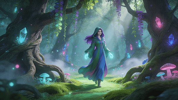
Prompt used:
Digital illustration of an enchanted fantasy forest featuring a mysterious female mage or forest guardian walking through a glowing woodland path. Surround her with ancient trees embedded with luminous crystals, twisting roots, hanging vines, and bioluminescent plants. Add ethereal fog, soft rays of light filtering through the canopy, floating magical particles, and subtle glowing mushrooms to enhance the magical atmosphere. Use a rich jewel-tone color palette with emerald green, sapphire blue, violet, and hints of glowing cyan and magenta. The style should be high-quality professional fantasy digital art, filled with intricate environmental detail, whimsical mood, dreamlike lighting, and immersive storytelling, creating a scene that feels mystical and alive.
What this shows: Complex environmental lighting is handled confidently here. Bioluminescent elements, volumetric fog, and layered color sources all tend to coexist without muddying each other. The character combines into the environment rather than floating on top of it. Seedream 4.5 holds its own on atmospheric scenes like this, and it often wins on color richness and mood.
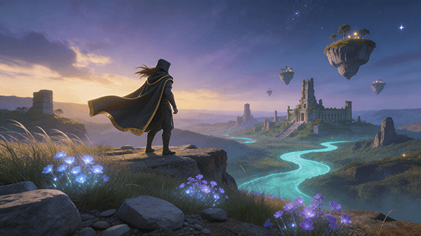
Prompt used:
Digital fantasy illustration of a cloaked adventurer standing on a cliff overlooking a vast magical valley at twilight, with floating islands, glowing rivers, and distant ancient ruins in the background. Add wind-swept hair and cape, giving the character a heroic and cinematic presence. The foreground should include wild grass, glowing flowers, and scattered stones, while the sky is filled with soft purple-blue clouds, golden sunset light, and faint stars beginning to appear. Use a vibrant but balanced fantasy palette with deep blues, violets, teal, and warm golden highlights. Style should be cinematic, highly detailed, atmospheric, and story-rich, with a strong sense of wonder, adventure, and epic fantasy worldbuilding.
What this shows: Wide-angle storytelling compositions with a lot of moving parts. Floating islands, layered sky gradients, distant ruins, and a character in the foreground are a lot to coordinate.
Seedream 4.5 tends to manage the depth and scale well. Fabric and cape movement reads convincingly. Sky gradients are particularly strong.
If there is a weakness in this category, it shows up occasionally in distant architectural detail, which can go slightly soft or generic.
These prompts test whether the output could actually be used for business or e-commerce without significant rework.
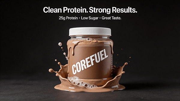
Prompt used:
Create a premium Instagram ad for a protein powder brand called "CoreFuel." Show the product jar as the hero object with splashing chocolate shake around it. Add the headline "Clean Protein. Strong Results." Include a smaller line: "25g Protein / Low Sugar / Great Taste." Modern sports branding, high contrast, crisp text, social-media-ready square format.
What this shows: Text generation in Seedream 4.5 is noticeably better than many competing models, though you should still expect to verify individual characters carefully. Headline text usually lands correctly. Smaller body text is where errors can appear.
Quick note on text accuracy: For any ad creative output, zoom into the smaller text lines before using the result. Seedream 4.5 handles short, prominent text well but occasionally fumbles at smaller sizes or with many lines of mixed information.
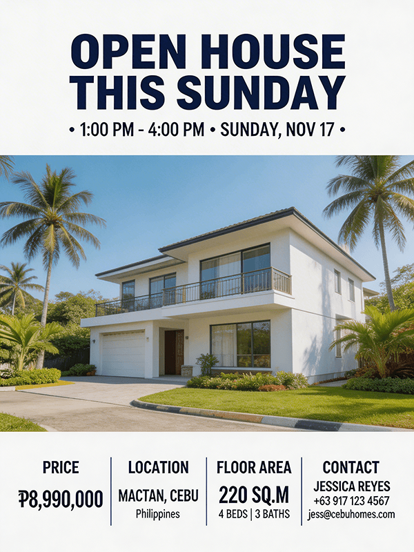
Prompt used:
Create a modern real estate flyer for a two-storey family home in Cebu. Include a large exterior house photo, headline "Open House This Sunday," and smaller sections for price, location, floor area, and contact details. Premium clean layout, white and navy palette, readable typography, realistic property marketing design.
What this shows: Layout understanding is solid. The model structures flyer elements with a logical visual hierarchy rather than scattering them randomly.
The house rendering tends to look realistic and appropriately photographed rather than cartoonish.
This is one of the more commercially useful outputs in this review because it requires the model to handle both image and structured text layout simultaneously.
Prompt used:
Create a Facebook ad for a dental clinic offering teeth whitening. Show a clean bright smiling portrait, headline "Smile Brighter in One Visit," and a small offer badge that says "Limited Promo This Month." Professional medical aesthetic, clean white and blue branding, crisp readable text, trustworthy and modern.
What this shows: Portrait photography simulation is clean and professional. Skin tones render naturally, the smile looks genuine rather than uncanny, and the layout respects the white-and-blue medical branding brief.
The badge element sometimes renders at a slightly awkward scale or angle, but overall this is a usable starting point for a real campaign creative.

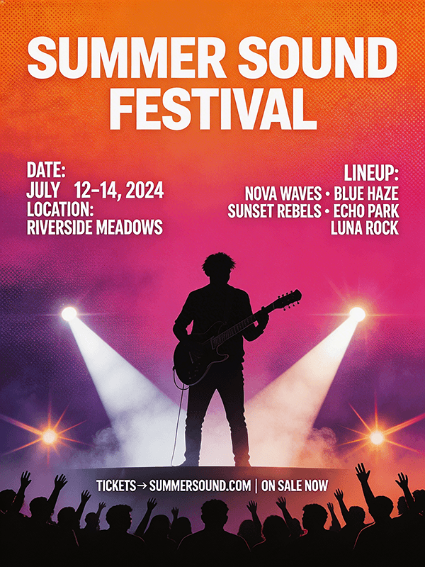
Prompt used:
Modern concert poster for Summer Music Festival, designed as a professional large-format music event poster with bold, oversized typography and a striking visual hierarchy. Feature a dramatic black silhouette of a guitarist performer in the foreground, slightly off-center for a dynamic layout, against a rich glowing gradient sky blending orange, magenta, pink, and deep violet. Add concert stage spotlights, lens flares, subtle smoke textures, halftone details, and layered abstract shapes to create depth and movement. Include a stylized crowd silhouette along the bottom edge with raised hands for a live festival atmosphere. Typography should be clean, bold, modern, and highly legible, with secondary text areas for date, location, lineup, and ticket details. Overall look should be energetic, stylish, high-contrast, contemporary, and print-ready, like an official festival promotional poster.
What this shows: This is one of the cleaner demonstrations of Seedream 4.5's ability to balance visual complexity with typographic clarity. Seedream 4.5 often produces warmer, more saturated gradients in this type of output.
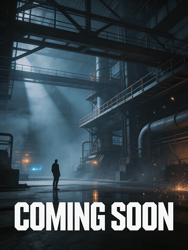
Prompt used:
Professional action-thriller movie poster featuring a lone silhouetted figure facing an expansive industrial environment of steel beams, catwalks, machinery, smoke, and distant glowing lights. The atmosphere is heavy and suspenseful, with cold cinematic grading, deep blue-gray shadows, and volumetric lighting cutting through haze to create dramatic depth. The figure should appear small but powerful, adding mystery and tension to the scene. Include subtle environmental details like sparks, drifting smoke, wet reflective ground, and faint background structures to make the setting feel immersive and realistic. At the bottom, display "COMING SOON" in large bold geometric typography, crisp and modern, with a premium film-poster layout. Overall aesthetic should be dark, intense, sleek, cinematic, and highly polished, like an official teaser one-sheet for a major studio release.
What this shows: Cinematic lighting and industrial environments are a strong match for this model. Volumetric haze, reflective wet ground, and the sense of vast space behind a small figure all tend to render convincingly. The "COMING SOON" text treatment usually comes out clean and film-poster appropriate.
This kind of output would work as a concept presentation or mood board without extra editing.
Prompt used:
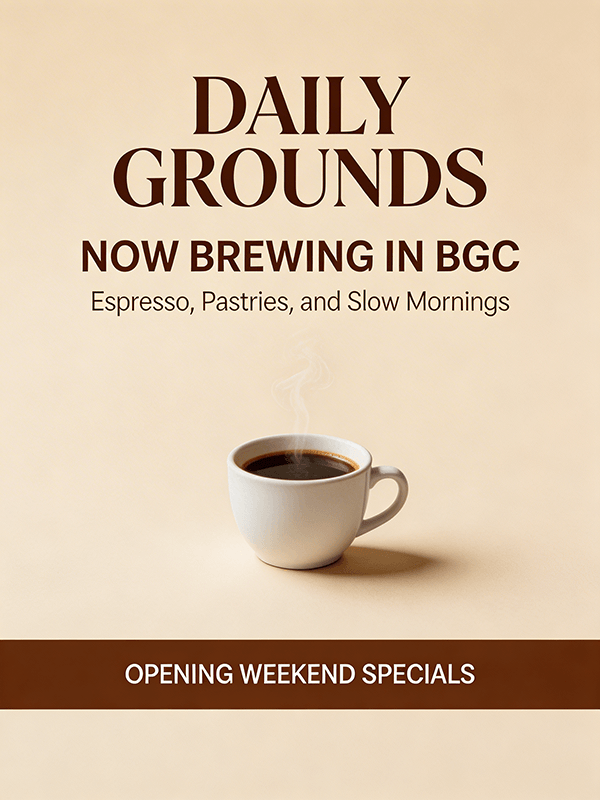
Create a stylish vertical poster for a new coffee shop called "Daily Grounds." Include the headline "Now Brewing in BGC," subheading "Espresso, Pastries, and Slow Mornings," and a bottom strip with "Opening Weekend Specials." Warm earthy tones, premium cafe branding, clean editorial layout, highly legible text.
What this shows: Brand name handling is reliable here. "Daily Grounds" as a business name renders correctly in prominent positions. Warm tonal palettes with editorial layout lean into Seedream 4.5's strengths.
The output tends to feel ready for print use rather than needing significant layout cleanup.
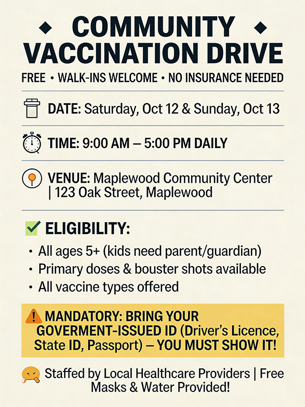
Prompt used:
Create an informational community poster for a vaccination drive. Include title, date, venue, time, eligibility reminders, and a short "Bring your ID" notice. Friendly healthcare design, clear icons, high readability, professional but approachable public service style, no clutter.
What this shows: This is one of the harder prompts in the set because it asks for structured informational hierarchy across many content types. Results are variable.
The visual style and iconography tend to land well.
Where it can struggle is keeping all the listed information fields accurately present and correctly labeled. Treat the output as a layout template and verify every text element before use.
Prompt used:
Create a photorealistic storefront window sign for a boutique fashion shop. Main headline: "Mid-Season Sale." Smaller text: "Selected Styles Up to 40% Off." Elegant fashion branding, believable glass reflections, realistic retail environment, clean typography, premium visual merchandising style.
What this shows: Environmental realism in retail settings is solid. Glass reflections, store lighting, and the relationship between sign and storefront tend to look convincing.
The fashion-forward typographic treatment usually matches the brief.
This is useful for mockup presentations and visual merchandising concepts.

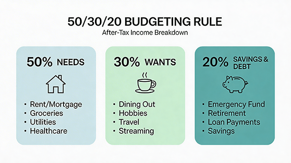
Prompt used:
Create a clean infographic explaining the 50/30/20 budgeting rule. Include labeled sections for needs, wants, and savings with simple icons and short supporting text. Minimal financial education style, white background, muted blue and green palette, highly legible layout.
What this shows: Simple infographic structure with three labeled sections is within Seedream 4.5's reliable range. The percentages and section labels tend to render correctly because they are short and prominent.
Icons are generated plausibly but may not always match the exact conceptual meaning you intended. A good starting point for educational content that would need a quick review pass.
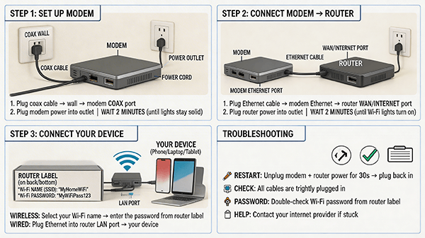
Prompt used:
Create a step-by-step explainer poster showing how to set up a home Wi-Fi router. Include modem, router, device connection, and troubleshooting basics. Use arrows, labeled components, concise instructional text, clean tech-education style, readable and practical.
What this shows: Sequential step layout and arrow-based flow diagrams are handled better here than in many comparable models. Component labeling varies in accuracy, so check technical labels carefully.
The overall visual structure tends to be clean and readable.
Works well as a first-draft concept for a tech explainer or instruction sheet.
Prompt used:
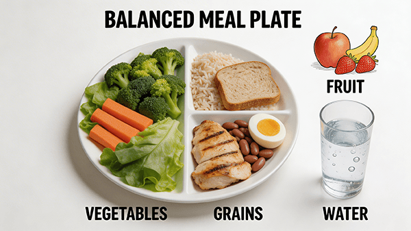
Create a classroom-style nutrition poster showing a balanced meal plate. Include labeled sections for vegetables, protein, grains, fruit, and water. Bright educational design, clean iconography, simple readable labels, family-friendly health visual.
What this shows: Plate diagram layouts are a familiar format and Seedream 4.5 handles them with confidence. Food category labels are usually placed logically.
Color is bright without being garish.
This is a reliable output category for anyone producing health education materials or classroom content.
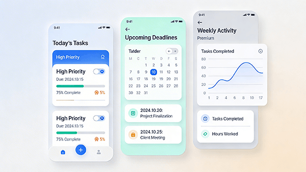
Prompt used:
Create a polished productivity app dashboard showing today's tasks, completion progress, upcoming deadlines, and a weekly activity graph. Modern mobile-first interface, clean cards, soft shadows, highly readable text, realistic SaaS product design.
What this shows: UI mockup generation is one of the more impressive capabilities in Seedream 4.5. Card layouts, progress bars, and graph elements tend to render with genuine visual coherence.
The output reads as a plausible product screen rather than a generic placeholder.
Useful for pitch decks, investor presentations, and concept portfolios.
Prompt used:
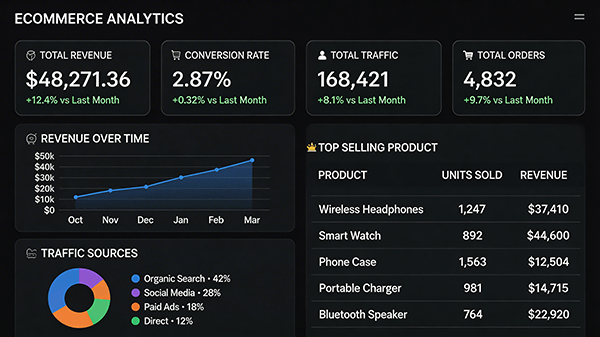
Create an ecommerce analytics dashboard showing revenue, conversion rate, top-selling products, and traffic sources. Dark interface, modern charts, clean data labeling, realistic admin panel design, professional UI presentation.
What this shows: Dark-mode data dashboards with many chart types are handled well. Bar charts, donut charts, and data cards tend to coexist in a visually logical layout.
Specific numbers in charts may not be meaningful, but the visual structure is convincing enough for presentation use.
This is where Seedream 4.5 pulls ahead of Seedream 5.0 Lite in practical utility for digital product work.
Prompt used:
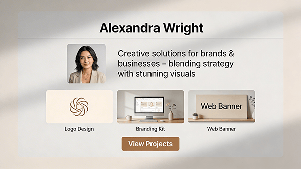
Create a premium website hero section for a freelance graphic designer. Include name, short intro, portfolio preview thumbnails, and a call-to-action button saying "View Projects." Clean modern web layout, minimal but high-end, realistic UI design with readable text.
What this shows: Hero section layouts with a clear hierarchy of name, intro text, thumbnails, and a CTA button tend to render with good proportional spacing. The "View Projects" button text usually lands correctly.
Portfolio thumbnail placeholders look intentional rather than random.
Strong output for anyone building a concept presentation or freelance portfolio proposal.
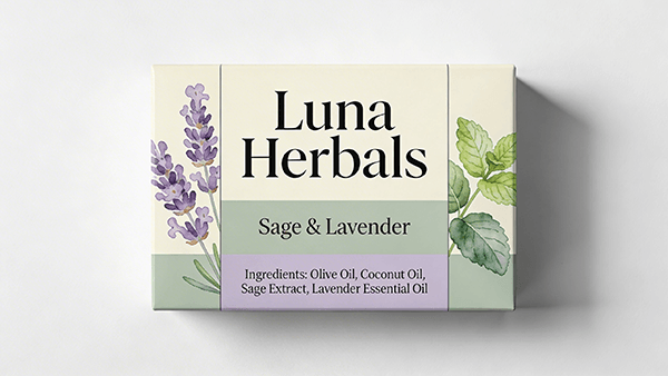
Prompt used:
Create packaging for a handmade soap brand called "Luna Herbals." Use soft cream and sage tones, botanical illustrations, and clean label structure. Include product name, scent variant, and a small natural ingredients line. Premium artisanal branding, print-ready front panel, crisp typography.
What this shows: Artisanal packaging with botanical illustration elements is a strong category for Seedream 4.5. The label structure tends to feel balanced and commercially credible. "Luna Herbals" renders correctly in a prominent position.
Botanical line art combines naturally into the label design. This is one of the more immediately usable packaging outputs in this review.
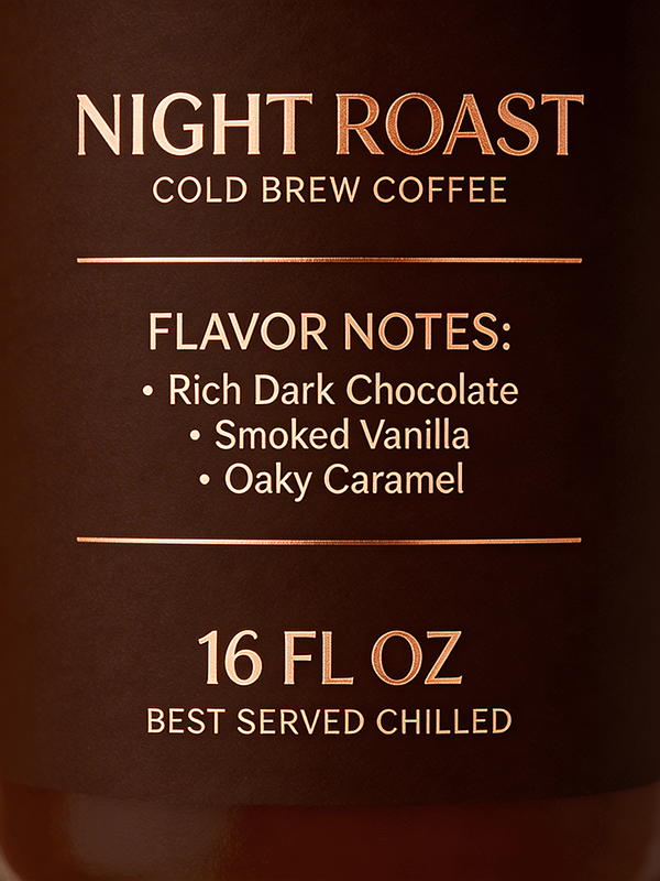
Prompt used:
Create a premium bottle label for a cold brew coffee brand called "Night Roast." Dark brown and copper palette, elegant modern branding, include flavor note text and volume detail. High-end beverage packaging aesthetic, realistic and commercially usable.
What this shows: Dark palette beverage labels with metallic accent tones render with genuine visual richness. The copper-on-dark-brown combination tends to feel premium rather than flat.
Flavor note text at smaller sizes should be verified. Overall output quality here is close to what you would expect from an early-stage branding concept, not a rough AI placeholder.
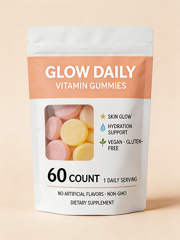
Prompt used:
Create a retail-ready stand-up pouch design for vitamin gummies called "Glow Daily." Include bright but clean wellness branding, product title, key benefits, and simple supplement style hierarchy. Friendly health product look, realistic packaging layout, highly legible.
What this shows: Stand-up pouch structure with realistic material rendering is handled confidently. The foil or matte pouch surface tends to look physically plausible. "Glow Daily" as a brand name renders correctly.
Benefit callouts at smaller text sizes need a careful check, but the layout hierarchy usually reflects the prompt's intent. A solid output for wellness brand concept work.
| # | Use Case | Why It Works Well |
|---|---|---|
| 1 | Marketing ad creatives and social media graphics | Strong text rendering, layout awareness, and brand tone following |
| 2 | Poster design across creative and informational styles | Reliable typographic hierarchy and multi-element composition |
| 3 | Packaging concept visuals | Surface text rendering and commercial product presentation |
| 4 | UI and dashboard mockups | Multi-panel layout coherence and structured visual output |
| 5 | Educational and explainer graphics | Labeled diagrams, proportional representation, clean layouts |
| 6 | Atmospheric illustration and scene work | Strong mood, color control, and compositional balance |
- Be specific about text. Because Seedream 4.5 is built with text rendering as a priority, the more precisely you write the text you want in your prompt, the more accurately it appears in the output. Write the exact phrase you want, use quotation marks around it within your prompt, and specify font style if it matters to your result.
- Give compositional instructions in plain language. You do not need technical layout terminology. Phrases like "sidebar on the left", "headline at the top", "product centered with space below for text", or "flat lay from above" all translate effectively into compositional output.
- Use style references through description rather than model names. Rather than referencing specific artistic styles or designer names, describe the visual qualities you want: earthy and artisanal, bold and minimalist, warm and illustrated, clinical and official. The model responds well to tonal and aesthetic description.
- Run multiple variations for human-focused prompts. When a prompt requires a recognizable human face with a specific emotional expression, generate three to five variations before selecting. Facial rendering consistency is the area with the most natural variation across outputs.
- Keep diagram and infographic prompts focused. The model handles single-concept diagrams with a limited number of labeled elements better than complex multi-step process flows. If you need a detailed process diagram, break it into simpler component prompts and mix the results.
- Fine print and small body text inside generated images is often illustrative rather than accurate. Headline-level text renders reliably, but anything intended as real, readable body copy within an image should be treated as a placeholder and replaced in a design tool.
- Complex character rendering at close range, particularly facial detail and costume precision, is less consistent than environmental or product-focused output. Prompts that rely on character personality conveyed through facial expression alone will need more variation cycles.
- Sequential or multi-step diagrams with many numbered stages can lose logical order. The model does not inherently understand process flow, only visual composition.
- Simple labeled diagrams work well, complex flowcharts do not.
- Production-ready files are not the output of any AI image generator including Seedream 4.5. The model produces concept-level, draft-level, and presentation-level visuals.
- Final production assets for packaging, print, or advertising still need professional design tools and human refinement.
Seedream 5.0 Lite is the more recent model in the same family. The practical differences worth knowing are these.
Seedream 4.5 tends to produce richer atmospheric depth in illustration and scene work, with a slightly more painterly quality that suits creative and mood-driven briefs. Seedream 5.0 Lite produces output with a cleaner, more structured finish that tends to perform better on technical layouts, UI mockups, and product renders where precision matters more than atmosphere.
For marketing, posters, and packaging concept work, both models perform well, and the difference is often less about capability and more about the visual character of the output. Seedream 4.5 leans warmer and more textured. Seedream 5.0 Lite leans cleaner and more precise.
If you are doing illustration, atmospheric scenes, or brand work where warmth and depth matter, Seedream 4.5 is worth choosing deliberately. If you are working primarily on interface concepts, product visualization, or anything where structural clarity is the priority, Seedream 5.0 Lite is likely the better starting point.
Seedream 4.5 is a capable and practically useful AI image generation tool for a wide range of real work scenarios. Its standout strength is the combination of reliable text rendering, layout awareness, and the ability to shift between creative and structured visual registers without requiring a fundamentally different approach to prompting.
The sample prompts reviewed across this chapter cover a large portion of the visual work that designers, marketers, educators, and content creators encounter regularly. In nearly every category, Seedream 4.5 produced output that would function at a minimum as a strong concept draft and in many cases as a near-final asset for digital use.
The limitations are real but predictable. Small text, complex facial detail, and multi-step diagrams need extra handling.
Production files need post-production work.
These are not unique to Seedream 4.5, and knowing them in advance means you can structure your prompts and workflow to work around them efficiently.
The most useful way to think about Seedream 4.5 is as a capable visual drafting tool that rewards clear, specific prompting and works best when you treat its output as a starting point with genuine quality rather than a finished product. Used that way, it compresses significant design and concept time into a faster, more iterative workflow without requiring the practitioner to sacrifice control over the final result.
TAGS: Generative Art
Related Tools:
Creates high-quality visuals with stronger precision and control
Creates visuals from text and images with pro-level accuracy

Creates visuals with highly accurate text and typography
AI tool for generating and editing images
Creates more accurate visuals from text and reference inputs

Turns text and reference images into highly stylized visuals