

Share this tool:
 |
Description:
MyLens AI is a visual thinking tool that turns raw information into interactive diagrams. You can start with a topic, pasted text, documents, images, spreadsheets, URLs, or YouTube videos, then ask MyLens to create a visual such as a timeline, mind map, flowchart, table, tree, funnel, or quadrant. Its best use is not replacing a full research tool or design app. It is helping you understand dense information faster by turning it into something you can click, expand, edit, and share.
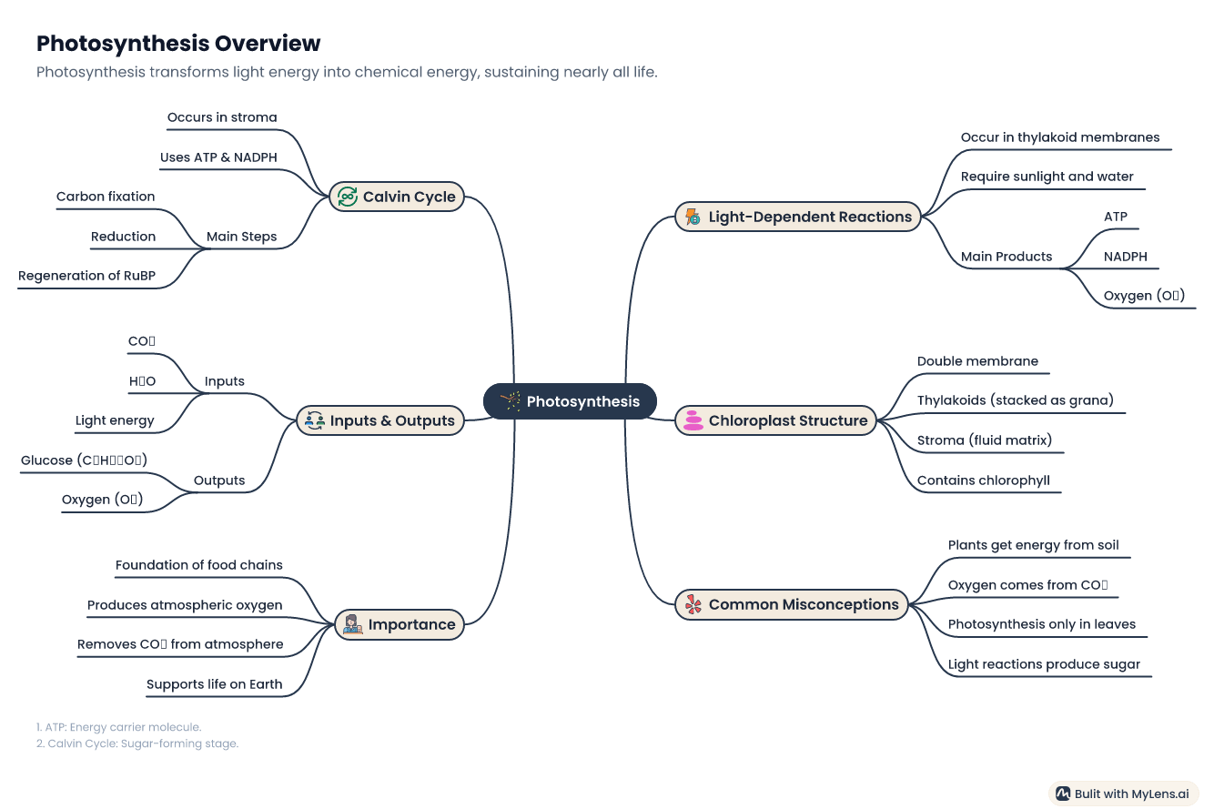
Prompt:
“Create an interactive mind map explaining photosynthesis for a high school biology student. Include the light-dependent reactions, Calvin cycle, chloroplast structure, inputs, outputs, and common misconceptions.”
This is a good first test because MyLens is built for turning topics, notes, and educational content into clickable visuals that help users explore and drill down into details.
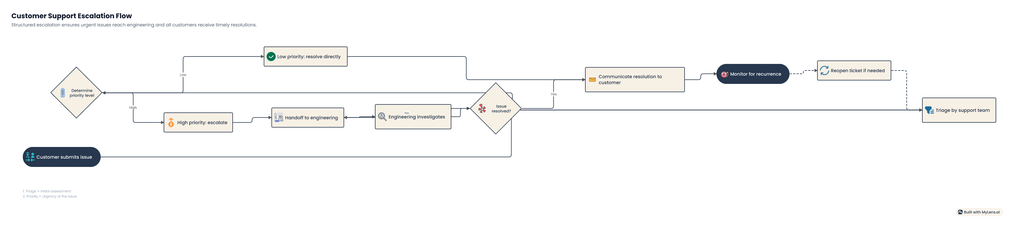
Prompt:
“Create a flowchart showing the customer support escalation process for a SaaS company. Include intake, ticket triage, priority levels, support handoff, engineering escalation, customer update, resolution, and post-case review.”
This fits MyLens well because the flowchart generator can convert text, PDFs, documents, spreadsheets, or ideas into logical interactive flowcharts.
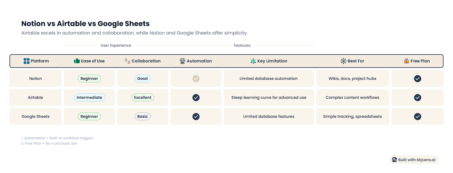
Prompt:
“Compare Notion, Airtable, and Google Sheets for a small content team. Create a table with columns for best use case, strengths, weaknesses, collaboration, automation, learning curve, and ideal user.”
This is useful when the information is not chronological or hierarchical. A table often works better for tool comparisons, feature breakdowns, vendor research, or buying decisions.
Prompt:
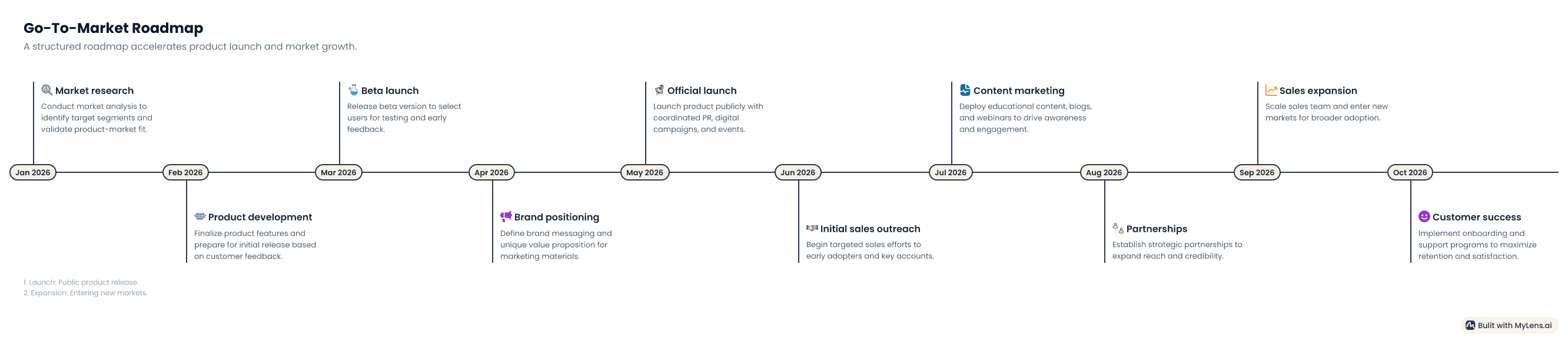
“Plan the best set of visuals for explaining a startup’s go-to-market strategy. Recommend which parts should be shown as a timeline, funnel, quadrant, table, or mind map, then generate the first visual.”
This uses MyLens Planner, which recommends the right visual sequence for a topic, document, or goal instead of forcing one diagram type onto every idea.
Before using this prompt: add a YouTube video link.
Prompt:
“Summarize this video into an interactive visual. Show the main ideas, key examples, important timestamps, and practical takeaways. Recommend the best visual format for understanding the content.”
MyLens supports YouTube as an input source and can turn video content into visual structures such as mind maps and timelines.
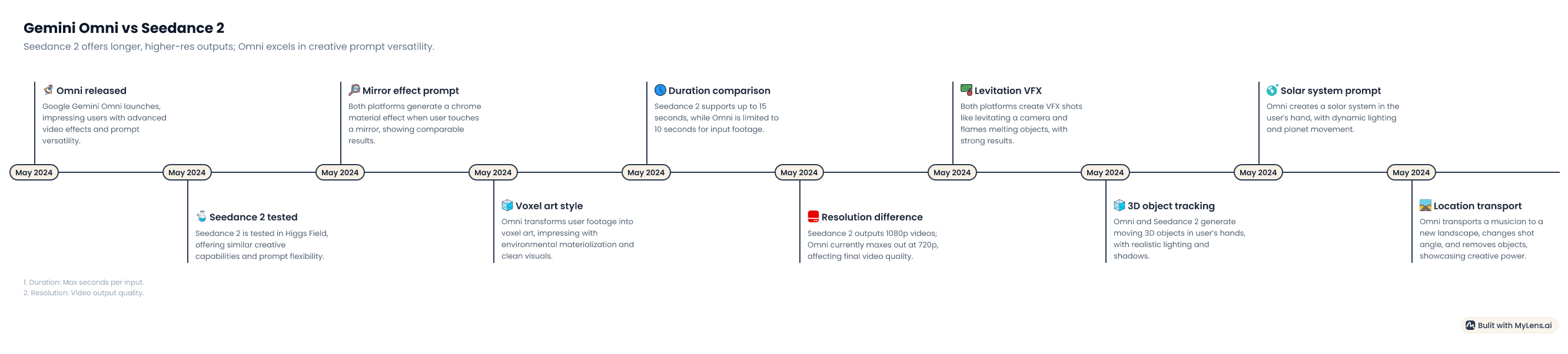
MyLens AI sits between a summarizer, a diagram generator, and a lightweight visual presentation tool. The workflow is simple: give it a source or topic, choose or let it suggest a visual type, then explore the result. The output is not just a static graphic. MyLens describes its visuals as interactive structures where users can expand nodes, drill into details, ask for refinements, and view source citations when available.
That makes it different from a standard AI chatbot. A chatbot gives you text. MyLens tries to give you structure. For dense information, that structure can matter more than another paragraph of summary.
MyLens creates clickable mind maps, timelines, flowcharts, tables, trees, funnels, and quadrants from user-provided content.
Users can start with text, documents, spreadsheets, images, URLs, or YouTube videos, depending on the task.
Mind maps can be expanded with AI, edited at the node level, or used to dive deeper into connected ideas.
Flowcharts and other visuals can be adjusted manually or refined with AI, including content, layout, colors, fonts, and styles.
MyLens says timelines can be shared, presented, or exported in formats such as PNG, PDF, and PowerPoint.
The Planner can recommend which visual types best fit different parts of a topic, which is useful for reports, lessons, strategy work, and presentations.
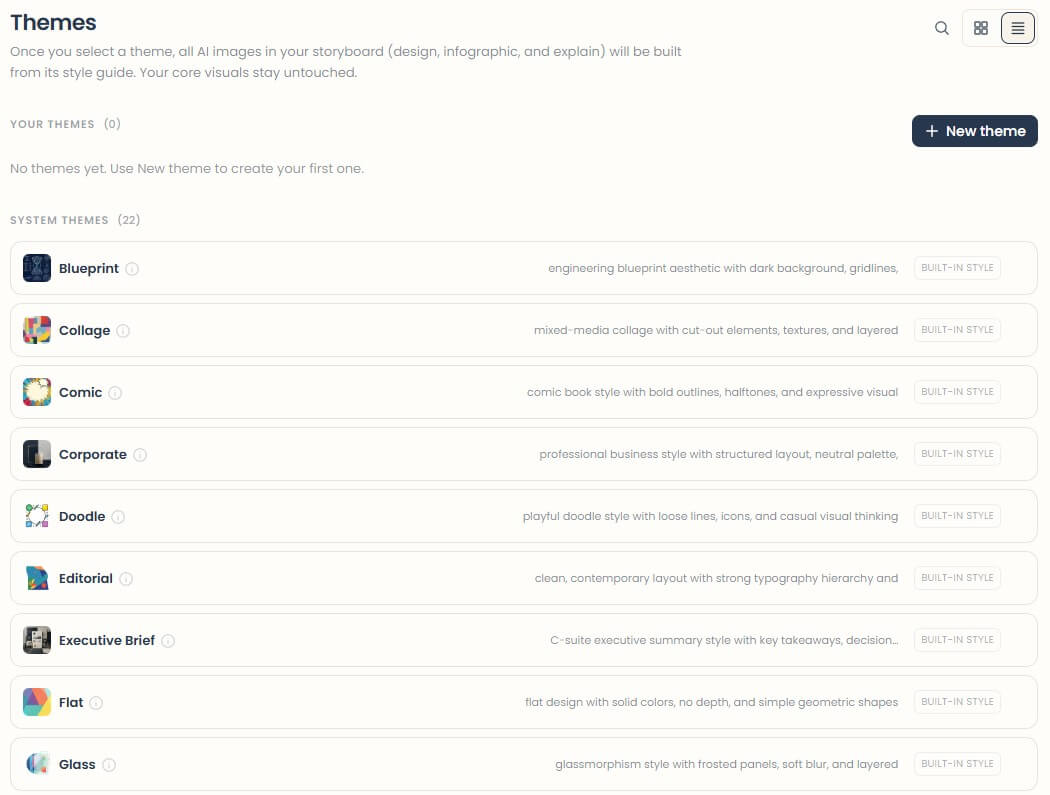
MyLens is strongest when the source material is too dense to scan quickly. Long notes, study materials, articles, slide outlines, research summaries, meeting concepts, historical topics, process documents, and comparison tasks are good fits.
The tool is also useful when you do not know the best format at the start. A timeline works for sequence. A mind map works for relationships. A flowchart works for steps and decisions. A table works for comparison. A quadrant works for prioritization or positioning. MyLens Planner is useful because it can map a topic into a sequence of visuals rather than making the user choose blindly.
The best use case is learning and communication. Students can turn notes into study visuals. Teachers can turn lesson plans into maps and flowcharts. Consultants can turn strategy notes into a clearer client-facing structure. Product teams can turn messy process notes into flows. Researchers can use timelines and mind maps to make patterns easier to see. MyLens’ education page specifically highlights study notes, textbooks, lecture notes, research papers, and online content as good source material for visual learning.
The workflow is friendly because it does not ask users to design from scratch. You paste, upload, link, or describe the source, then generate a visual. From there, you can refine the result, expand specific parts, edit the structure, or export and share it.
This is where MyLens feels more practical than a traditional diagramming tool. Tools like draw.io or Lucidchart are better when you already know exactly what the diagram should look like. MyLens is better when you are still trying to understand the material. It helps you find the structure first, then lets you refine it.
The trade-off is control. AI-generated visuals can save time, but they may not match your preferred wording, emphasis, hierarchy, or visual style on the first try. The editing tools matter because the first version should be treated as a draft, not a final diagram.
- Give MyLens a clear goal. “Explain this for a sales team” will produce a different visual than “explain this for a beginner student.”
- Name the visual type when you already know it. Ask for a timeline for history, a flowchart for processes, a table for comparisons, and a mind map for concepts.
- Use source material when accuracy matters. A prompt alone is fine for brainstorming, but uploaded notes, articles, documents, or videos give the AI more context.
- Ask for a simpler second pass. Good follow-up prompts include “make this easier for beginners,” “reduce this to the five most important branches,” or “turn this into a presentation-ready structure.”
MyLens is not a full research verification tool. It can help organize information, but users should still check facts, sources, and context before using visuals in serious reports or decisions.
It is also not a full manual design platform. You can edit and style visuals, but the product’s main strength is AI-generated structure, not pixel-level design control.
The output quality depends heavily on the input. Clean notes, clear source material, and specific prompts lead to better visuals. Vague prompts can lead to broad, generic diagrams.
There is also a risk of oversimplification. Visuals are useful because they compress information, but compression can hide nuance. For complex legal, medical, technical, or policy topics, MyLens should be a starting point for understanding, not the final authority.
MyLens AI is best for turning complex information into interactive visual structures that are easier to explore, teach, present, and remember. Its strongest fit is students, educators, researchers, consultants, product teams, and professionals who work with dense notes, documents, videos, or strategy material.
The main caveat is that MyLens helps you see structure, not guarantee truth. Use it to understand faster, then review the facts, refine the hierarchy, and edit the visual before sharing it.
TAGS: Research Productivity
Related Tools:
Automates formula generation in spreadsheets
Automatically plans and organizes your schedule

Transforms screen recordings into high-quality product videos

Provides quick summary of Google search results

Turns Google Sheets into fully functional websites
Creates concise summaries of YouTube videos